Barattini Productions
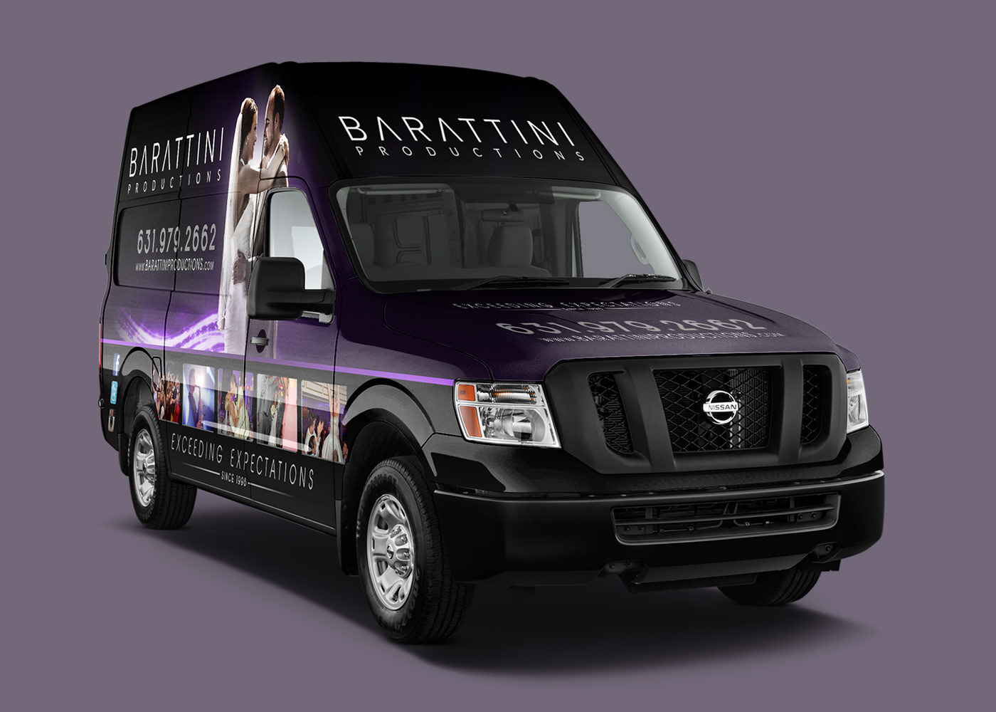
Barattini Productions needed a fresh and elegant design to represent their event production company. As weddings were the bulk of their business, we elected to highlight that aspect foremost. The client and I contended that their wedding photography should speak for itself. We used the abstract light trail to draw the eye to each embracing couple on top and separated the design with the accented purple line.
We kept the top half rather essential, using name and contact information only. For type, we used the Opificio typeface (which was designed reminiscent of Italian architecture), with a fair amount of letter tracking to keep the design open and less cluttered. The color scheme was dark in nature, but allowed the purple hues to light areas of focus. The web interface design follows suit, using a minimalist color palette, bold imagery and accented gradients.

Woody's Exterminating
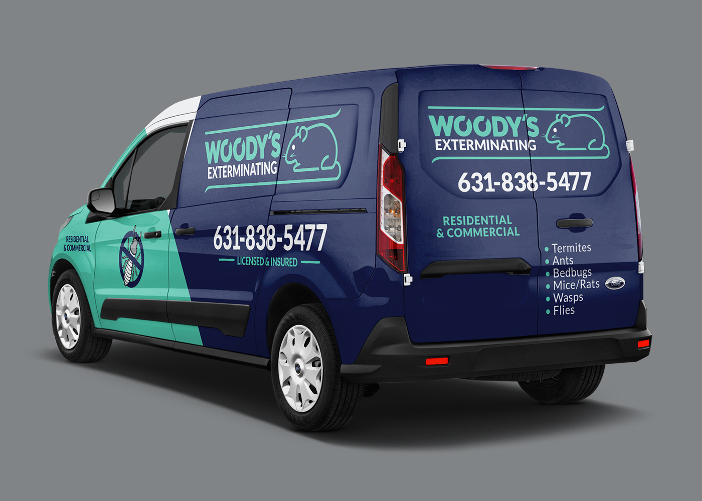
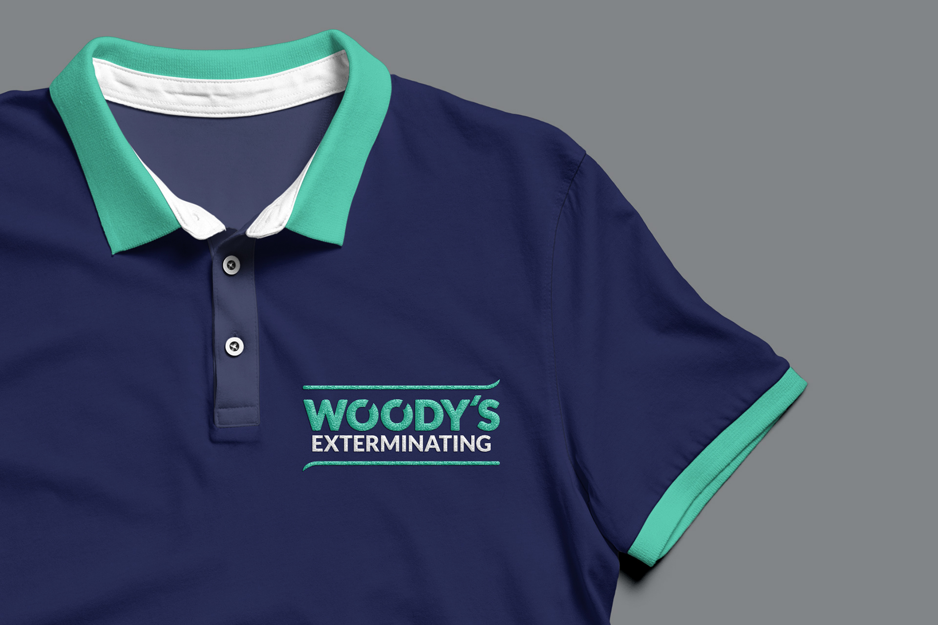
Starting and maintaining a small business is no easy feat, so we wanted to give Woody’s the best possible chance of success with a slick visual identity to match his high quality service. Whereas his competitors chose to go busy and haphazard in their branding choices, we decided to keep the design clean and clutter free. The logo needed to be recognizable yet adaptable to work in a variety of different circumstances. We think we hit the nail on the head by designing a responsive logo capable of working on web, print and apparel.


Long Island Pool & Spa
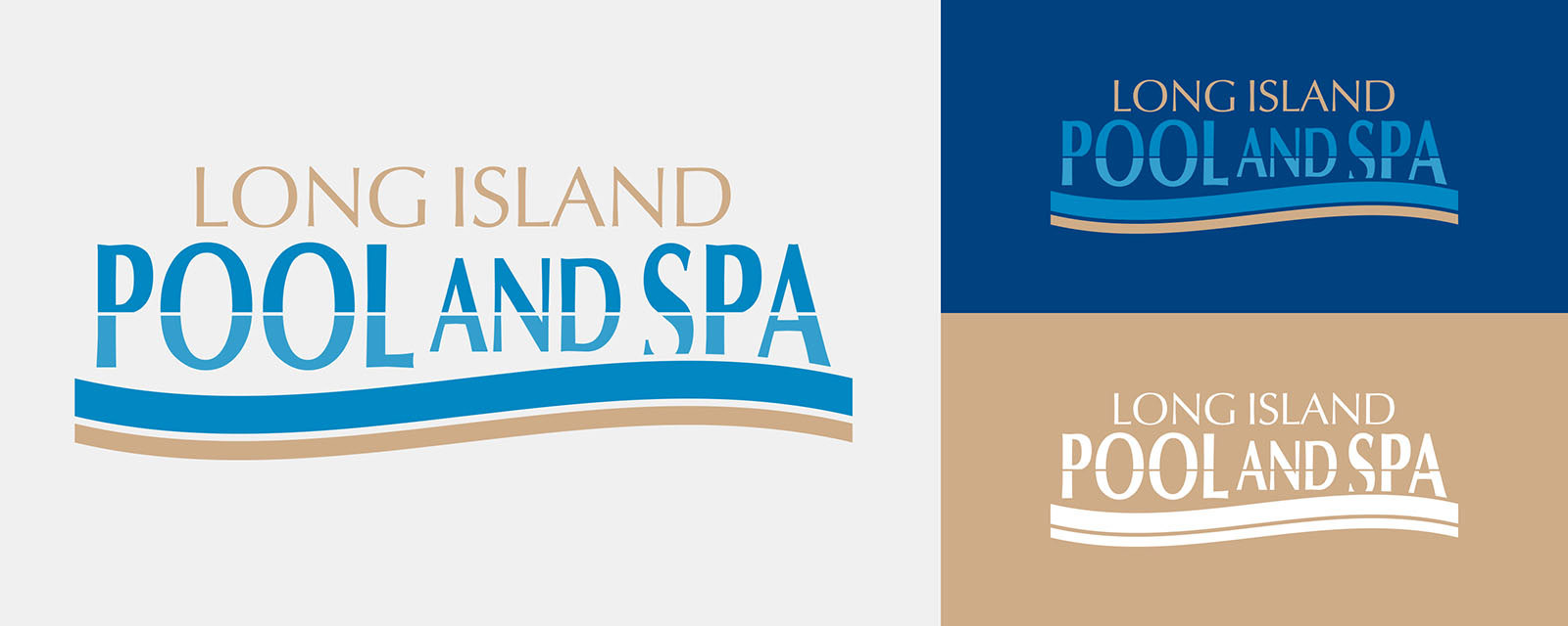
Long Island Pool & Spa had a large fleet of vehicles in need of a rebrand. We discussed allowing the design to move and flow, replicating the fluid nature of water. Central to the design was the idea of a two toned curved line, similar to an ocean wave, to be included in the logo. We also used this line to separate the calm pool water of the top from the darkened spa water of the bottom, in a way that move the viewer's eye from back to front. Top down it looks as though the line exists naturally as a pool lip or border.
In terms of typography, we toyed with the thick versus thin interplay. The extra heavy Futura font mixes well against the narrow and organic shapes of the “Pool & Spa” portion of the logo. The color palette used was a mix of pool water blue and skin tone tan. We tried to keep the design simple and relegated it to two color families only.
Porsche of Huntington
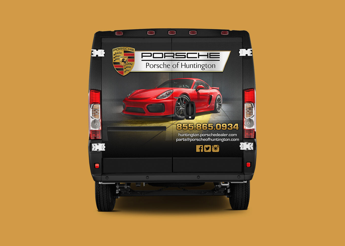
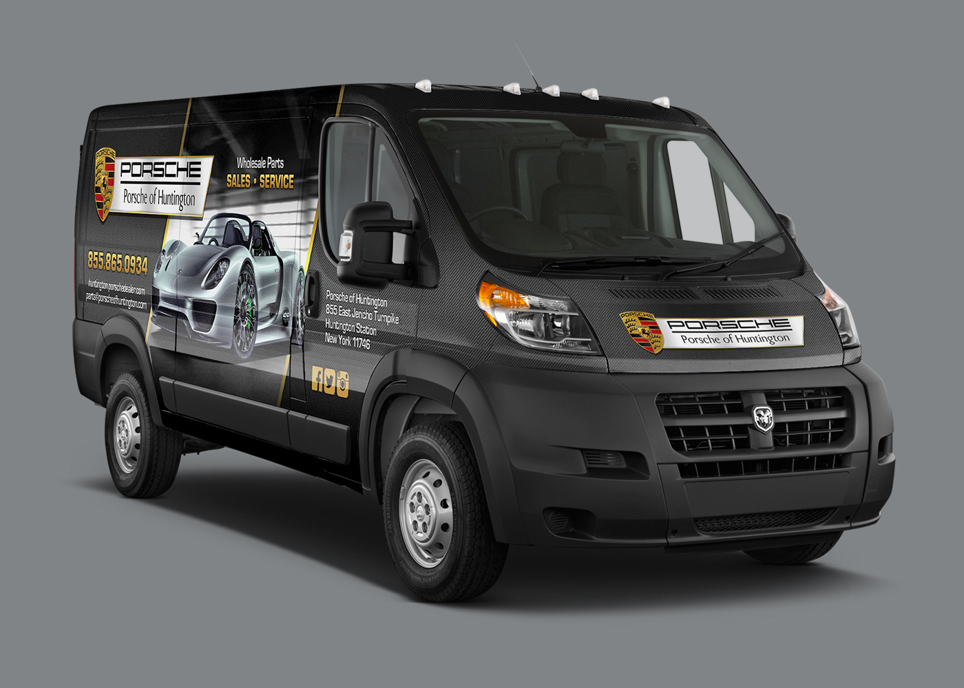
The Porsche of Huntington project presented the unique challenge to maintain the stylish, curvy look of the Porsche brand but to also counterbalance it with the modern racing feel that many potential buyers may prefer. The client and I discussed using a more angular form to juxtapose against the curvature of the cars. We both agreed that carbon fiber and sheet metal textures would integrate nicely with the exotic featured vehicles.
In terms of hierarchy of information, we kept it safe. The logo is most prominent, contact second and the “Sales • Service” rounding out in third. Although the vehicle was set up to deliver parts, we figured that the racing and high performance imagery should be the main draw. The color selection used in the project was gathered from the Porsche crest logo. We didn’t want to stray too far from the brand.
BMW of Oyster Bay
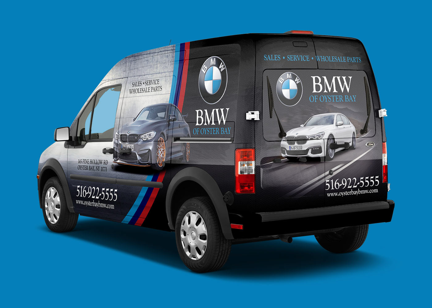
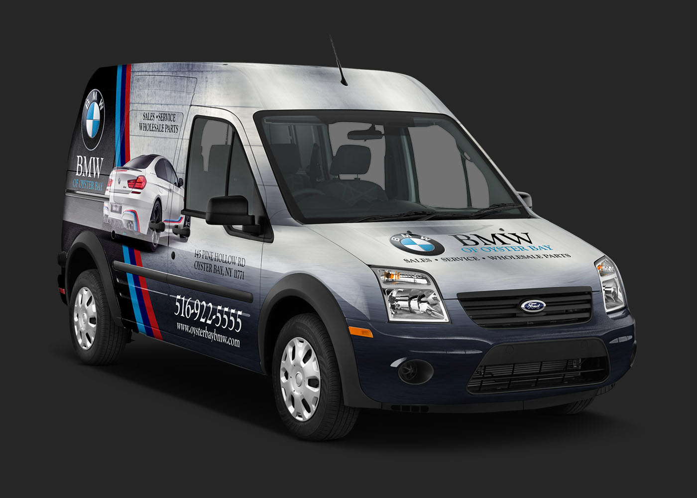
The BMW brand has always been clean and articulate. The Oyster Bay dealership expected nothing less. The client and I addressed this project as a way to promote the M series and latest line of cars. The M stripe has for years represented the performance leg of the BMW program. We suggested using it as a transition point between the back carbon fiber and front metal textures.
When deliberating on what cars to feature, we opted to keep the cars in the high luxury department. We wanted to sell the idea of performance, even if potential customers decided on something more modest in the end. The 2016 M6 coupe, 2015 7 Series and 2016 M4 GTS were perfect choices to establish the need to own something both luxurious and sporty. The color palette used in the project was a direct replication of the M stripe. The carbon fiber and metal textures gives a solid neutral background for the M stripe colors to shine.
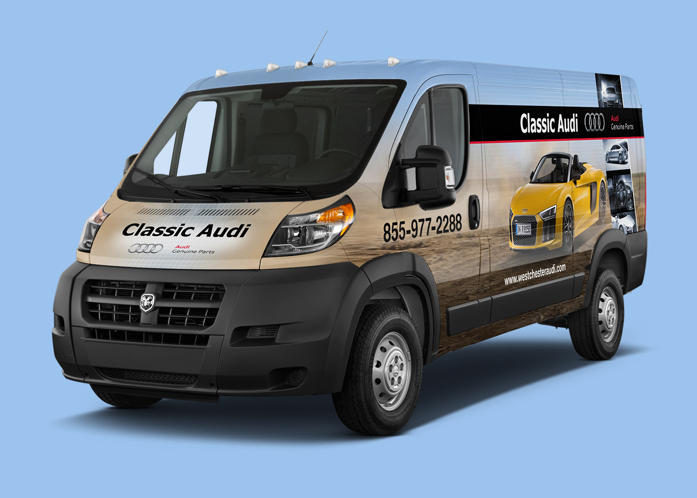
Classic Audi
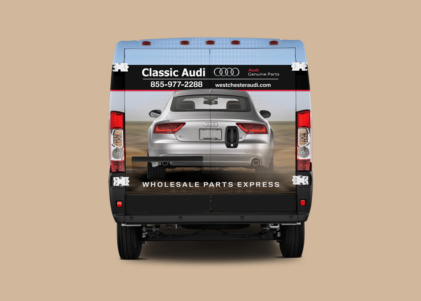
For the Classic Audi project, it was our intent to come up with a design that could be used utilized by other partner dealerships as well. In the end, this layout was employed by three others in the surrounding area. We wanted to adopt a layout that was universal, with only the need to substitute text, logos and vehicles. This is similar to the Audi co-op program, where a dealership may choose a standard design within the branding guidelines and implement their own information. To achieve this, we used an angled stripe of abstract vehicle images with a blue color overlay to showcase whatever current line of cars Audi had at the time. The background in neutral with a good line of sight to make rendering easy.
Riverhead Bay Motors
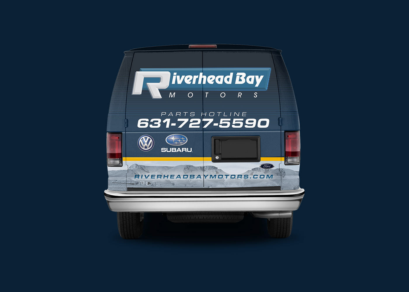
When discussing the project, the client and I thought it best to highlight the rally car aspect of the respective manufacturers first and foremost. After all, Volkswagen and Subaru are synonymous with high powered auto racing. We wanted to illicit that feeling, the drive for adventure, in the design. The Subaru WRX STI and Volkswagen GRC Beetle fly off the vehicle, spewing sand and debris in their wake. Your next vehicle may not be destined for the rally course, but the idea of high performance might be good enough to get you in the door.
