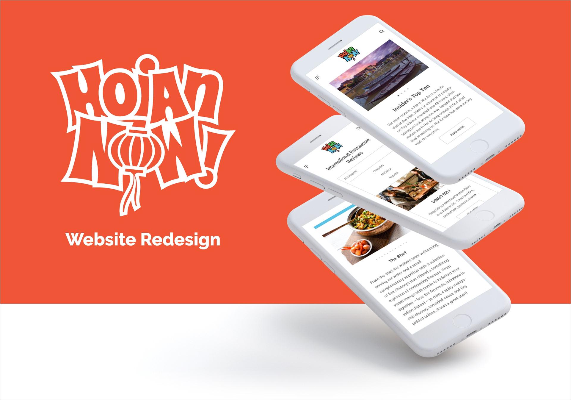
Project Description
Hoi An Now is a tourism website dedicated to the city of Hoi An, Vietnam. I was initially brought on to help with web design, but my role expanded to include UX work. We would meet daily to revise outdated parts of the site and discuss the reorganization of the site's architecture. My contract was for one month and upon completion, provided the team with a number of deliverables (including style sheets, wireframes and updated visual branding).
The Guide to Everything Hoi An
You’ve just arrived in Hoi An, Vietnam without much of a plan. Where can I get the best Cao Lau? How much should I tip? Should I even tip? Am I getting ripped off? What do I do with the kids? Hoi An Now answers all those questions and more. The premier travel guide to all things Hoi An, the website boasts around 5700 sessions a month. It was evident then that the user’s experience has to be as streamlined and organized as possible.
Two Different Users
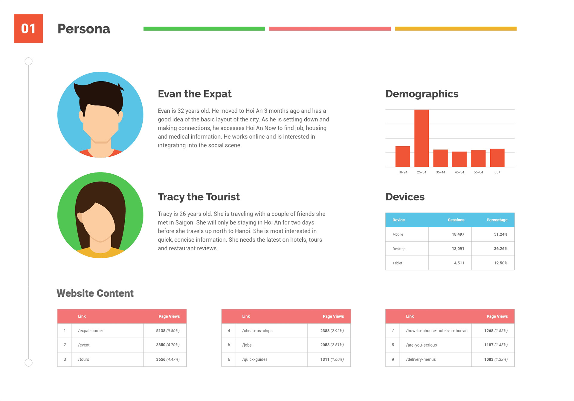
Hoi An Now has two typical users. Either you were new to Hoi An, but planned to stay for more than 3 months as an “expat” or you were passing through more generally as a tourist on a two day excursion. These two personas needed two completely different user experiences. Whereas Tracy the Tourist would ideally be interested in tours, food and hotels, Evan the Expat had no need for that information. He was more concerned with harder to find items, tips on housing and job placements. They do share some similarities however. They are both fairly young; in the 25-34 age range. They both access the site using their mobile device and they are both consider travel to be a top priority. The website needed to cater to both of these identities to provide the best possible service to its users.
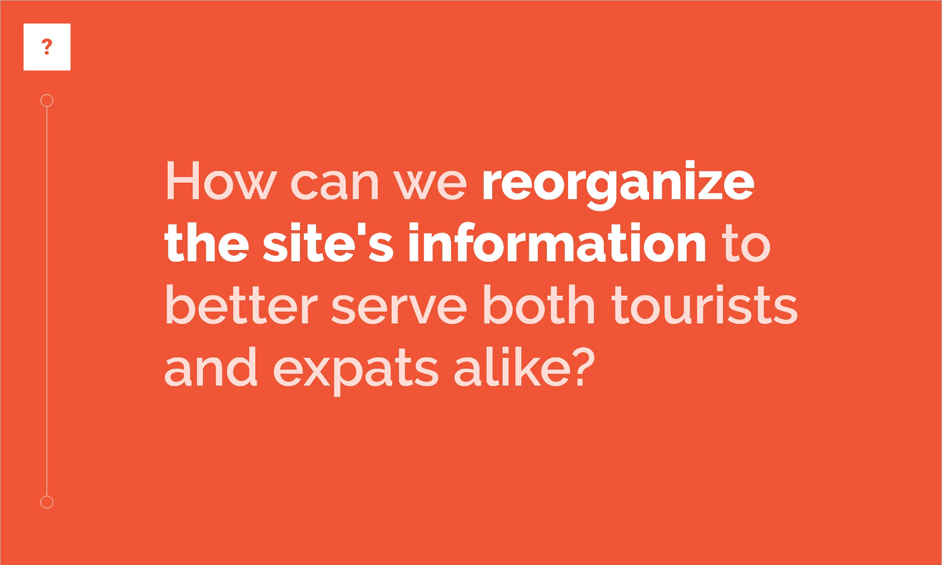
Reorganization for User's Needs
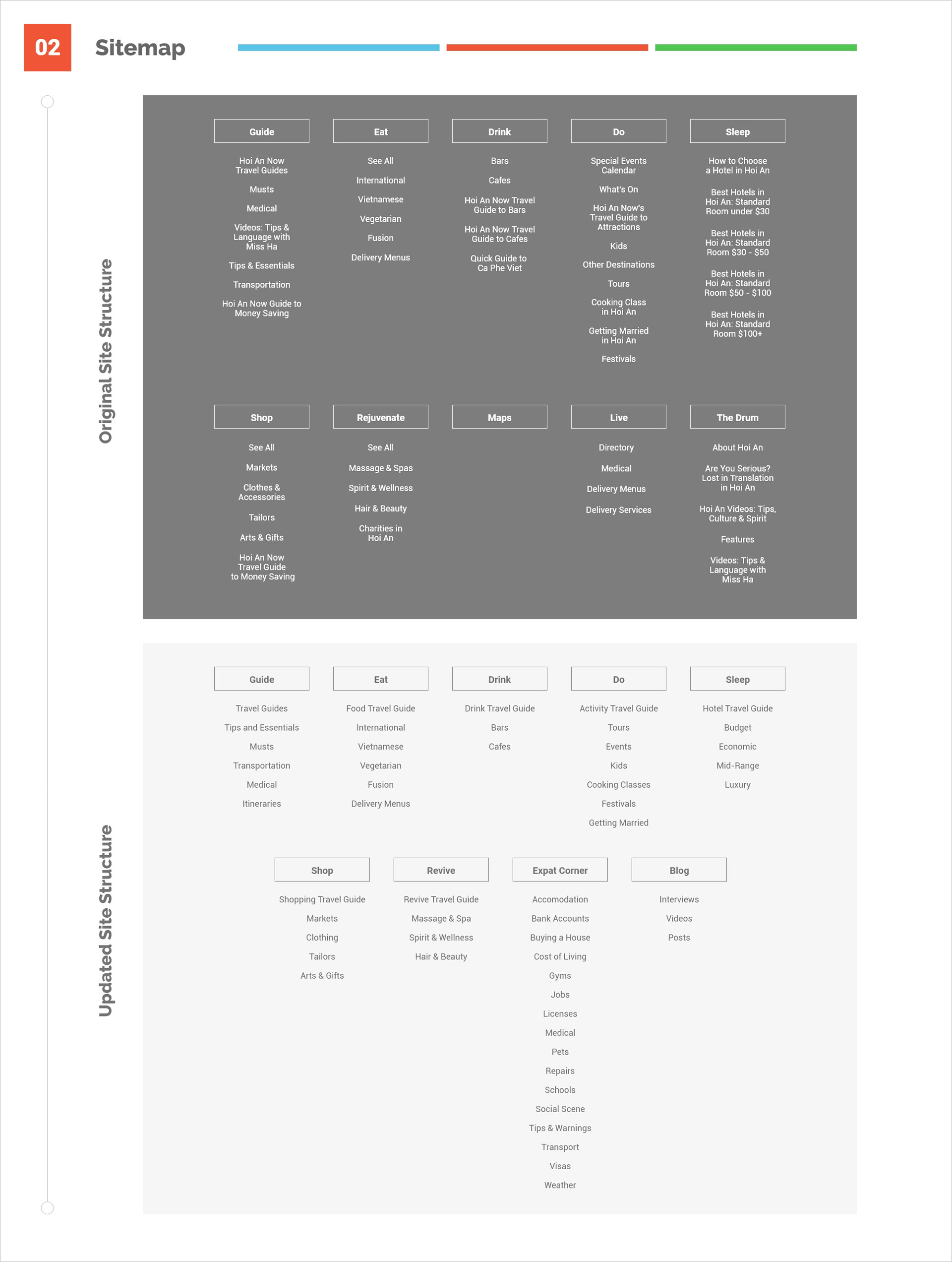
The first step in redesigning the site was to update the link structure. The information is there, but navigating to it was confusing. We worked to organize each section to be as clear as possible. Some of the most useful pages on the site are their “travel guides”. These provide a short introduction to a certain aspect of life in Hoi An. Let’s say you’ve settled into town and you’re interested in something to eat. Their food travel guide will give you a quick overview of where to go and what to order. Under the old architecture, these travel guides were confusing and often hard to find. We worked to keep them at the top of each content link with more in depth written articles below. Before the redesign, anything “expat” related was also displaced and unorganized. We removed “Maps”, “Live” and “The Drum” and replaced them with a bona fide “Expat Corner” (everything Evan would need during his stay in Hoi An) and “Blog” (which features interviews, video and posts).
Simplicity & Consistency
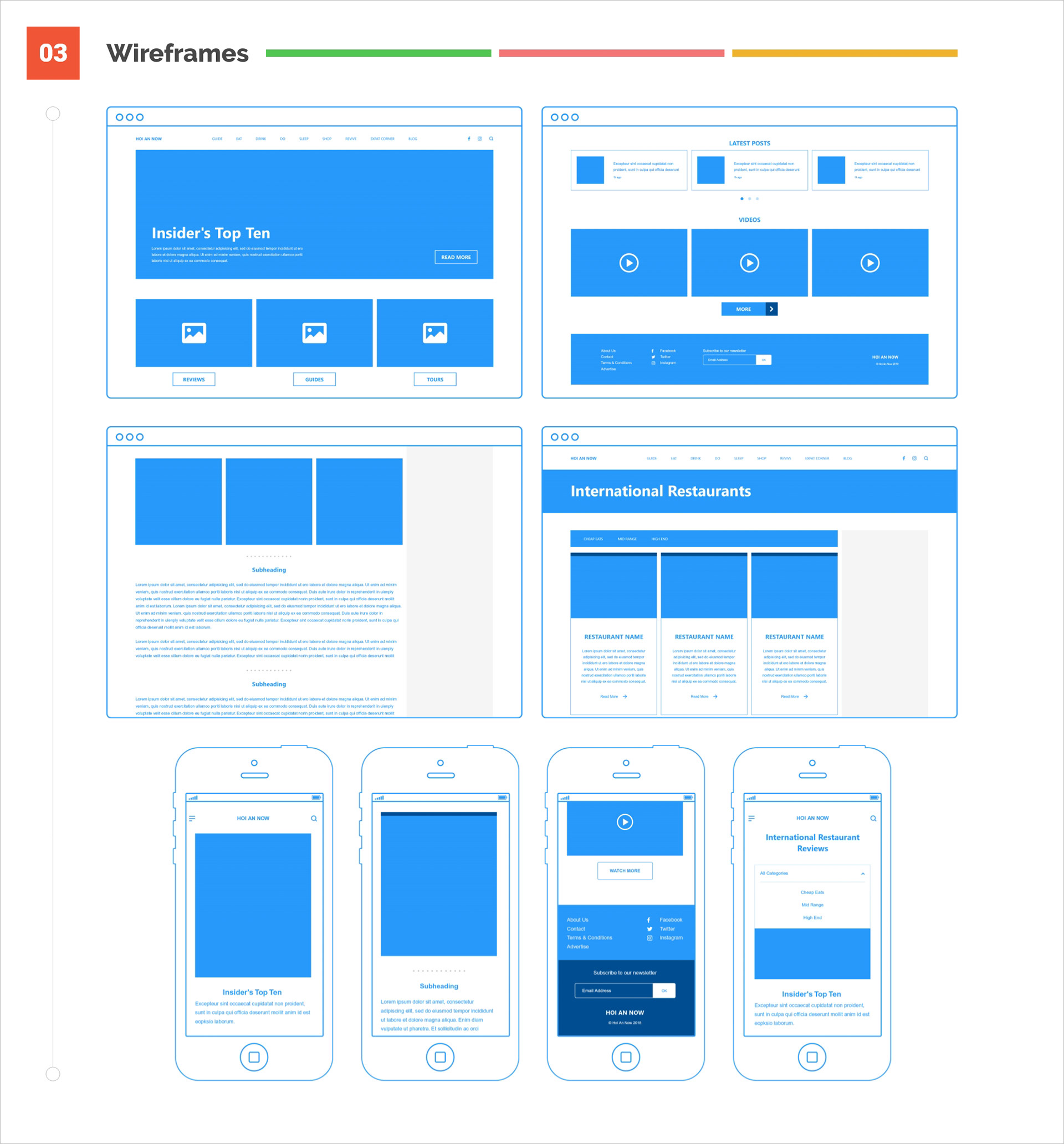
When designing the wireframes, it was of utmost importance that we keep the design clean and uncluttered. The writing was savvy and sharp, so why not let it speak for itself? The images were beautifully shot, why take away from them? Users need information fast, so we wanted to design in a way that would provide the quickest user flow possible. This meant showcasing all the most used items on the homepage above the viewport. It also meant tailoring each review section to be uniform with each other, as to avoid any confusing navigation.
Optimization for Articles and Reviews
One of the bigger changes in terms of organization was the rebuild of the article layout. Instead of adding images and text haphazardly on a case by case basis, each review follows a clearly defined, top down layout. By using this outline, the writers and creators at Hoi An Now could spend more time writing and less time trying to design each article separately. Making use of subheadings, photo grids and text hierarchy gives each review a balanced feel.
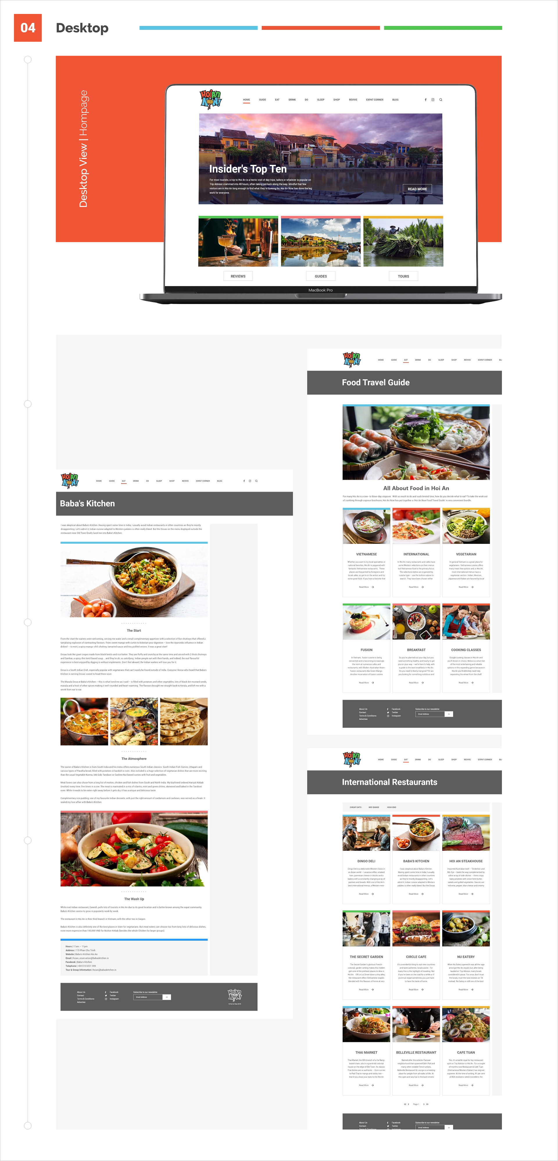
Putting together the high fidelity version was straightforward, as the bulk of the work was done in wireframes. While we kept their colorful identity intact, the most noticeable changes were in how they were implemented. We kept the color palette relegated to five colors only (orange, blue, green, pink and yellow). Using each of them to highlight images adds flair without being overbearing. I simplified the logo as well, taking out the gradients and replacing them with the five aforementioned colors. I also redesigned it to be use in black and white (apparent in footer).
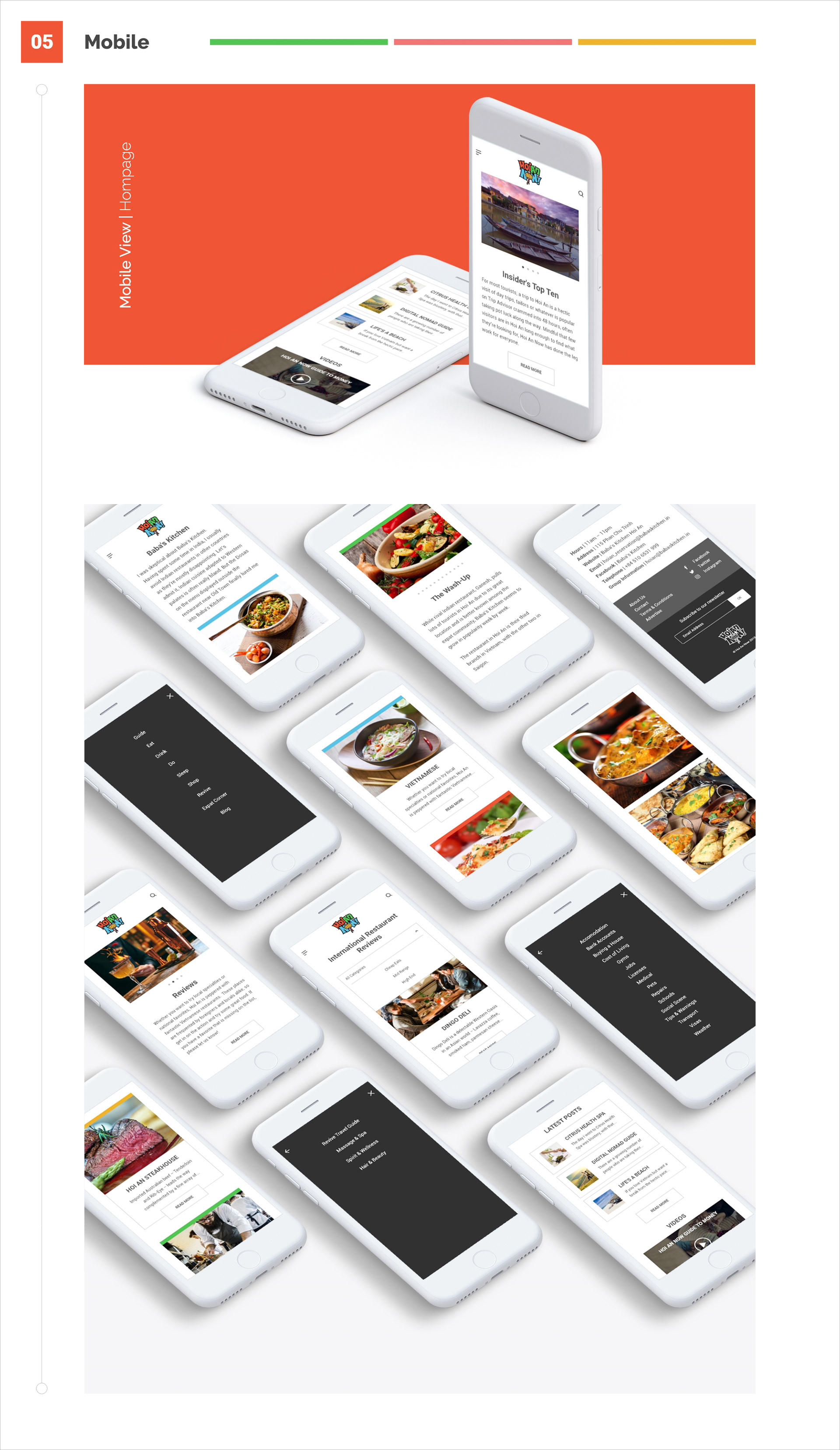
Smooth Mobile Navigation for Tourists
For the mobile redesign, it was imperative that we get the navigation smooth and intuitive. Since the majority of users would access the site through their phone, we wanted the experience to be as easy as possible. Upon first entering the site, the items that tourists need the most (best of lists, reviews and tour information) are only a quick scroll to the left away. The menu screen was overhauled to fill the entire screen whereas previously it was clunky and hard to use. We also removed the drop down menus in favor of a more instinctual slide function to move through the item lists.
Testing & More Research
If I worked on this project longer, I would have field tested the mobile prototype with actual tourist's around town. This would be an opportunity to see what I implemented correctly and what still needs more clarification. Are user's using the travel guides like I initially inferred? Are there too many clicks to get to where they need to be? Once they've accessed what they need, can they now find additional information quickly? I had the pleasure of interviewing a Hoi An native while on this project. She was very familiar with the expat and tourist scenes, so most of my insights came from these sessions. If I had more time with Hoi An Now, I would have liked to interview users similar to our "Tracy the Tourist" persona to understand their needs more concretely.